
Help centerReportsWhat's in a report
What's in a report
Every report has the same shape, so a reader who has seen one can read them all.
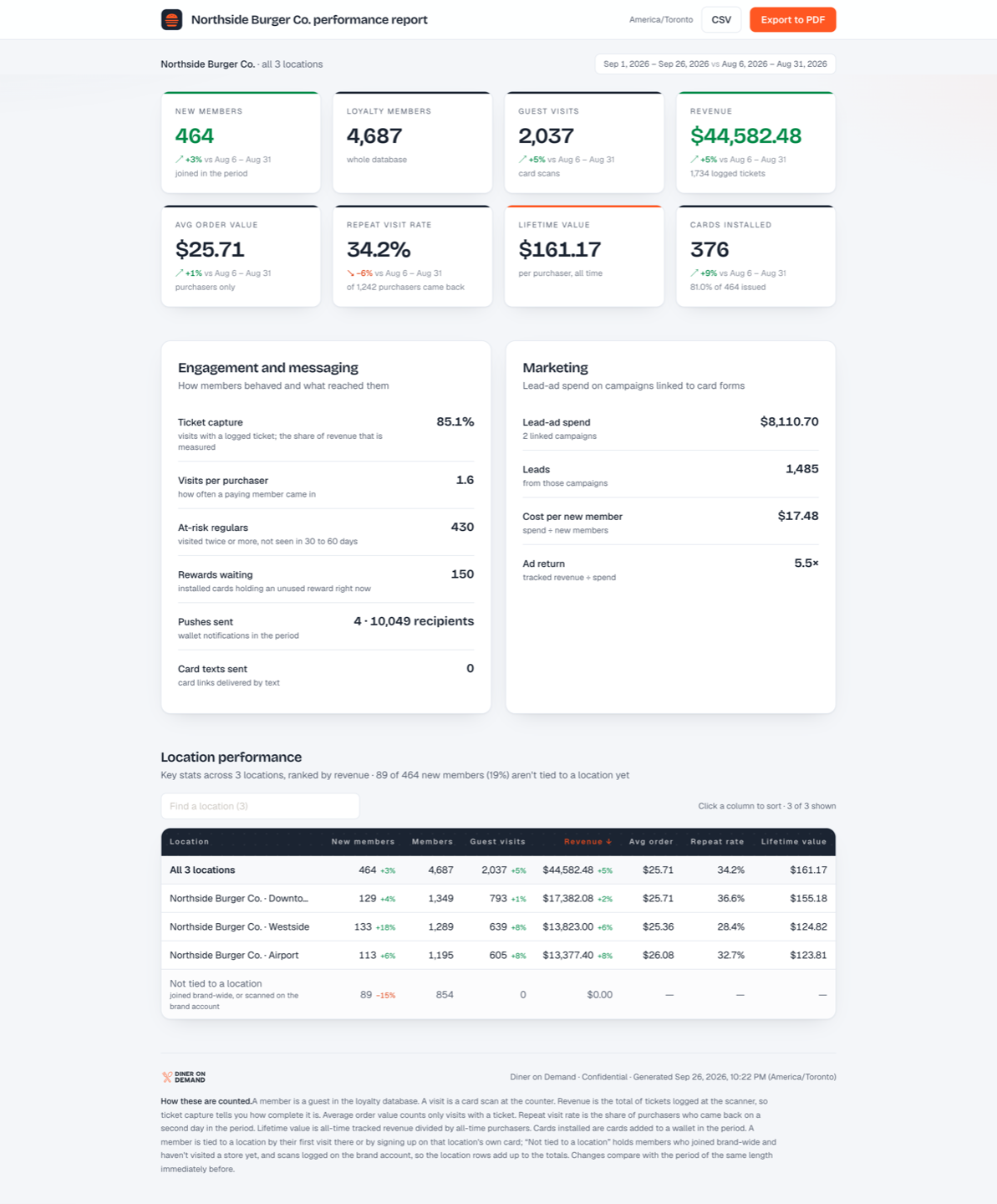
The header
The business name, the report title, which store time the dates are in (one zone, or each store's own for a brand across time zones), and buttons for CSV and Export to PDF. Under it, the scope (which locations) and the period, with the previous period it's compared to when the link was made with a comparison.
The eight figures
| Figure | What it means |
|---|---|
| New members | Guests who joined in the period |
| Total members | Everyone in the database at the end of the period |
| Guest visits | Card scans in the period |
| Revenue | Ticket amounts entered at the scanner |
| Avg order value | Revenue per ticket, purchasers only |
| Repeat visit rate | Share of purchasers who came back |
| Lifetime value | Average member value over time |
| Rewards waiting | Rewards earned but not yet redeemed, which is future visits waiting to happen |
Each figure shows the change against the previous period, so a reader can see direction without doing arithmetic. A link made without the comparison shows the figures alone.
Engagement and messaging
Ticket capture rate, install rate, visits per purchaser, pushes sent and texts sent. This section tells a reader how healthy the program is, not just how big.
Marketing
Only when Enable marketing was ticked: ad spend, leads, cost per new member (CAC), and lifetime value per dollar of acquisition cost.
Location performance
On a multi-location brand, a table with one row per location and the same columns, plus a totals row. Search narrows it, which matters when there are fifty rows.
A last row called Not tied to a location holds members whose signup couldn't be attributed to a store, usually because they joined through the brand-wide signup page or a lead form that isn't mapped to a location. See Reports by location.
The footer
Definitions for every figure, so nobody has to ask what "repeat visit rate" means.
Still stuck? Email support@dinerondemand.com.